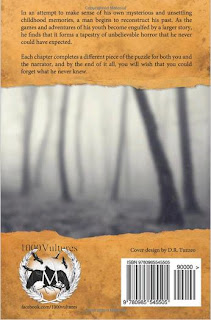
Here are the front and back covers of Penpal, as designed by D.R. Tuzzeo, who created the covers, and Chris Au (www.chrisau-design.co.uk), who conceived the font used for the title and for the chapter headings. The interior layout design and typography used in the book is courtesy of Jocelyn Michaud of www.chezjocelyn.com, however, we are going to focus on the exterior layout.
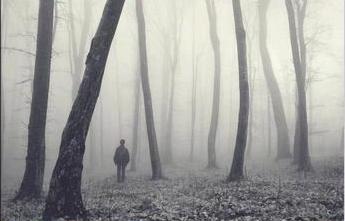
Now, right off the bat, when looking at the front cover, you notice a rather clear, monochrome photograph of a boy with his back to the viewer, facing the depths of a foggy woods. As for the back, you recognize that it is a blurry photograph of the same forest, but from the opposite direction and with the noticeable lack of the boy from before.
Uh oh Scooby, something's not right.
Even without having read the stories previously, the viewer will be able to easily guess that, at some point in the book, a young boy ventures into the forest and disappears. Zoinks. Let's look at the rest of the cover.
There is a dirty footprint in the upper right corner of the front cover, and there appears to be on both covers a torn and stained Manila envelope, which functions as a banner, revealing the photo from inside of it. A red ink postage stamp adorns the lower left corner of the front, right abover the author's name.
As for the typography: the frontal font, used for the title and the author's name, is black, ominously irregular and imperfect, in all-caps and with rough edges. "A novel by" is, curiously enough, in a simple, minimalist serif font, a bit like that of type-writer, but in white ink.
The overall style smacks a bit of a Slenderman vibe, which may or may not have had an influence on the stories themselves, but which does indeed come to mind for those who are acquainted with the Slenderman mythos - a legend born out of photo manipulations posted on the internet, involving a preternatural child-stalker who frequents woods (though, he can pop up anywhere, really - nobody is truly safe from him).
Let's get down to the ratings, shall we? *lightning strikes, doors creak, window panes tremble, ravens shriek, Vincent Price laughs, shadow of Hitchcock appears briefly on the wall*
Appearance: 4
This cover could work as a movie poster for a film adaptation (there IS a film coming out, and there is a short film that has already come out, but I have not seen any posters for them yet, so I have nothing to compare the cover with). The monochromatic middle is a nice piece of photography on its own, containing a spooky, dark forest that looks like it's straight out of a well-made Silent Hill game, but what really adds to the photo and what completes the appeal of the cover are the banners covering the top and the bottom. The stained, dark beige of a worn Manila envelope is far from being a grating color, and it works well with the black, grey and white of the middle photo and the black and white of the font.
Orange, black and white are great colors to use for a book cover. And I'm not talking about solely horror books, I'm referring to any book. These three colors straddle the line between warm and cold colors, and are both striking enough to attract the eye and simple enough to not "over-do it".
Attention-grabbing: 5
It certainly is unusual, and it reflects modern horror (as exemplified by House of Leaves or creepypasta). Even the back of the book would grab your eye, and this is what really garners the full five points.
What draws the attention is the contrast between the header and footer (dirty Manila envelope) and the middle section (black and white photo), as well as the eerie and chilling sight of a boy standing by himself in the dark, misty woods.
The header and footer are also of interest in themselves, since the torn-paper-look is uncommon for book covers, especially if that torn paper is actually a dirty, sent envelope, disclosing a photo of a boy in the woods.
Innovation: 4
I would have given the front cover alone a 3, but the back cover is what gets another point. A cover that spans both sides of a book with creativity and art is terrific and charming. There are far too few book covers that do what this book cover does. There is a distinct interactivity involved in this "double-cover", that is, the cover art plays around with the subject matter, thereby enhancing the general eeriness, and the viewer can get mentally involved in this aesthetic playfulness.
Plot-likeness: 5
The most delicious part of this cover is that even the littlest detail alludes to some segment of the story.
- envelope and postage stamp --> the signs of a Penpal
- irregular font --> the unpractised handwriting of a young boy, presumably the one shown on the cover. Alternatively, the font suggests a deranged person scrawled some words down, alluding to the mysterious stalker
- boy in a forest, venturing deeper, and a footprint --> a boy is a protagonist, focal point and victim in the story, going ever deeper into trouble, and a forest is a focal location
- perspective in the front and back covers --> reflection of the perspective of the stalker
- boy in a dark forest that has completely covered terrain --> a scene straight out of the first chapter, Footsteps (also alluded to by the footprint)
My overall impression I find difficult to express in numbers. Let's just say, I like the cover very, very much :) And apparently, so do many, many others. D.R. Tuzzeo, who, as I mentioned before, created the cover, also hand-illustrated a poster for Penpal, depicting a scene from the chapter Screens. Tuzzeo also created a poster for another horror novel which, I believe, started on the No Sleep Sub-Reddit as well. It is called "Doors" and it was written by Kelsey Donald.
So, big thumbs up to D.R. Tuzzeo for the lovely cover and posters, and kudos to Dathan Auerbach's fantastic story.
- Wager


No comments:
Post a Comment